Bellingham Public Library
A case study of Bellingham Public Library's website redesign. The goal: To bring the BPL website into the 21st century and create a visually pleasing and easy-to-use experience for patrons.
Bellingham Public Library
My ROLE: Design lead, Front-end web design, ui/ux
Length: 4 months (fall 2017)
Agency: Big fresh
Libraries in general aren't the most flashy places. But why can't their websites be? The goal of this redesign was to bring the Bellingham Public Library (BPL) website into the 21st century and create a visually pleasing and easy-to-use experience for patrons.
Process
In our kickoff meeting with BPL, we first discussed what our goals and objectives were for the new site. Primarily we want a simpler interface, a less overwhelming homepage, better organization of content and a friendlier theme. We then focused on the strengths and weaknesses of the existing site and looked to library websites in major cities for inspiration.

As you can see, the existing BPL site was merely a mess of links void of imagery and direction.

Chicago Public Library
The masonry layout worked really well to organize content into set categories (e.g. blog, staff list, events). We decided this would be the best way to make the existing BPL content more easily digestible and indexable while introducing a more user-friendly and image-heavy layout.

L.A. Public Library
The use of real estate in the header and nav was practical yet visually pleasing with a strong use of brand colors. We wanted to incorporate a site-wide search function in the BPL's header to find pages or titles rather than a long list of links in a sidebar.
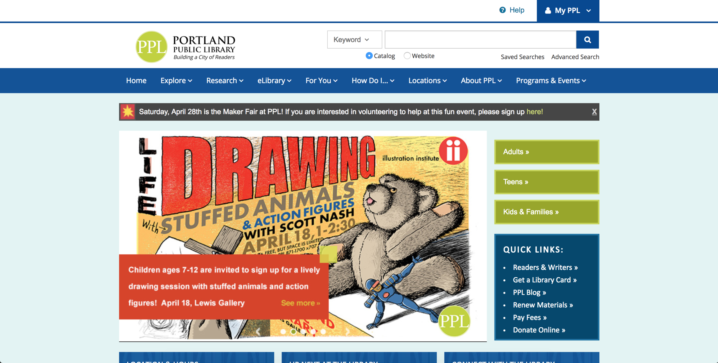
Portland Public Library
Along with an image heavy hero section, we loved the idea of having a quick link section (e.g. location and hours, pay fine, get a library card). Users will commonly be looking for those options, why bury them in the nav?

Initial wireframing presented these questions and problems: What is the most important content for the average library patron when they come to the BPL's website? How do we make it the smoothest process possible for the user to get the info they're looking for? Based on our research we decided that the header should include site-wide and title search functionality, quick links to the most common user-actions, and an inclusive main nav: Account, Books, Using the Library, Digital Library, Kids & Teens, and News & Events. There was so much vital content that each main nav needed a dropdown. This would allow the user to access virtually everything right off the bat, but also cater to the most common scenarios for a visitor. Beyond the header, the masonry format of posts from various categories made the most sense for Wordpress and responsive to have a flex-height 3x3 grid of easily editable content. After all, the library staff is in charge of maintaining the site once it's out of the hands of development.
The general content and menu post-types fell into place much more easily. As long as we kept some quick link options, had a featured image and an organized list, we felt comfortable with most layout options. Breadcrumbs would be used to track where the user is on the site. A newsletter signup (which wound up on the right rather than in between content) would be beneficial to the user for learning about new releases and events.

The hi-fi mockups came together nicely, the client was excited to see the brand colors and image heavy layout bring the redesign to life. In the tablet and mobile views, you can see how the nav, dropdown, and sign in will function. The scrolling experience on mobile was very smooth as we tested it in Sketch Mirror. At this point in the process, it was very important to talk through how the the navigation and masonry cards will work with the client. Through Wordpress, post-pages can be assigned categories, in this case they are events, news, staff picks, etc. When they create a new featured card on the homepage they simply select the category and it will render as the proper color and pull in the post page title. The description can be customized in order to fit properly.
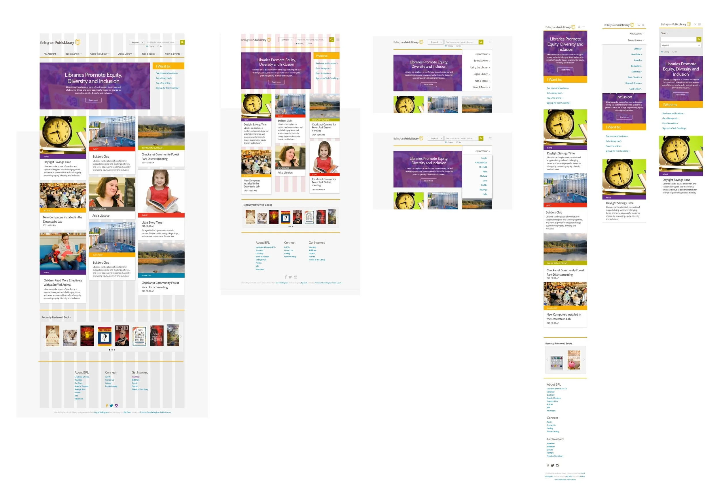
The hi-fi mockups came together nicely, the client was excited to see the brand colors and image heavy layout bring the redesign to life. In the tablet and mobile views, you can see how the nav, dropdown, and sign in will function. The scrolling experience on mobile was very smooth as we tested it in Sketch Mirror. At this point in the process, it was very important to talk through how the the navigation and masonry cards will work with the client. Through Wordpress, post-pages can be assigned categories, in this case they are events, news, staff picks, etc. When they create a new featured card on the homepage they simply select the category and it will render as the proper color and pull in the post page title. The description can be customized in order to fit properly.